HEALTHWISE
An Easier Way to Connect Patients with Doctors in Nigeria
Mobile App
Website
Healthcare
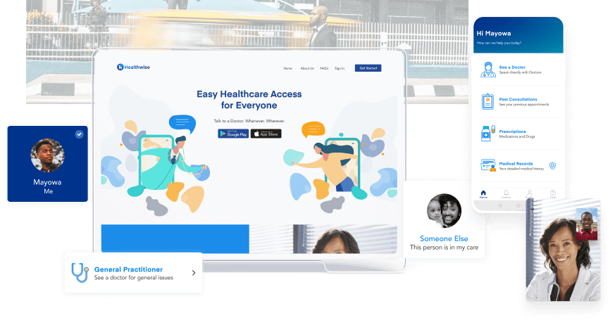
The Digital solution called HealthWise aims to bridge the gap between patients and doctors by providing healthcare consultation through a smartphone application.
In this case study you can follow along on my journey to use technology to alleviate one of the pain points in the Nigerian healthcare industry.
Highlights
MY ROLE
Researcher, UX/Product designer, Brand Designer
TOOLS
Sketch, Invision, Marvel Pop, Photoshop, Illustrator, Zoom
CLIENT
Academic Project
SKILLS & METHODS
Experimentation, A/B testing, Qualitative research, , User interviews, Usability testing, UX design, UI design
TIMELINE
Jul - Aug 2019, 8 Weeks
ARTIFACTS
Flows, wireframe sketches, screens, responsive web pages.
TEAM
The Problem
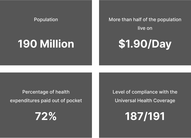
The state of healthcare in Nigeria is disappointing. Nearly 72% of the health expenditure of Nigerians are paid out of pocket forcing people to choose between their health, housing, education and even food for their children.
I was born and raised in Nigeria and this was a challenge I personally faced. It was difficult to get access to good healthcare. Good healthcare is very expensive and the good hospitals have limited resources.
🇳🇬 NIGERIA STATS: SOURCE
What I did
I created a digital experience to connect patients with doctors in Nigeria. I chose to create an Android agnostic mobile application based on research data on device usage of Nigerians. (source).
Try Prototype Out →
Defining the problem
“Who am I designing for and what challenges are they facing currently with healthcare access?”. I kept asking myself these questions as I tried to define the problem space and who to design for. I started first by narrowing down my user group to Nigerians between the ages of 18 - 35 (millennial age range) as this age range has the highest rate of internet adoption (source).
OPPORTUNITY
There are over 92 million Internet-enabled devices in Nigeria, it is expected that mobile health will proliferate and this will change the way patients gather health information and resources, propagating a new age of e-patients.
HYPOTHESIS
I believe that Nigerians have a very bad experience with the health care system as a result of the lack of resources and manpower to fulfill the needs of the large country. I also believe Nigerians are seeking alternatives to ease their health care access situation.
Research really opened my eyes
I conducted user interviews with 5 Nigerians based in Nigeria and from these sessions I was able to draw the following insights
1
Interviewees complained about issues such as lack of staff in the hospitals and limited resources. This results in long wait times at the good hospitals.
2
Interviewees responded that they would prefer to do self-medication and would rather avoid the hospitals if possible.
3
85 percent of the interviewees have at one point searched for health information online and googled their symptoms.
Synthesizing these insights made me come up with a refined problem statement:
How might we enable patients to easily access affordable health information and consultation?
Who am I designing for?
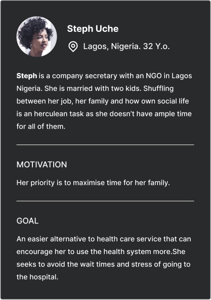
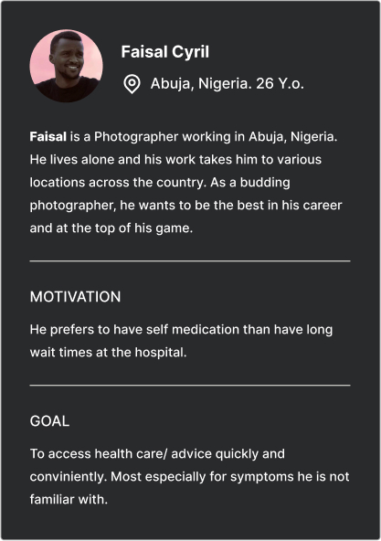
From the research session, I was able to come up with two proto-personas and prioritize features to support them.
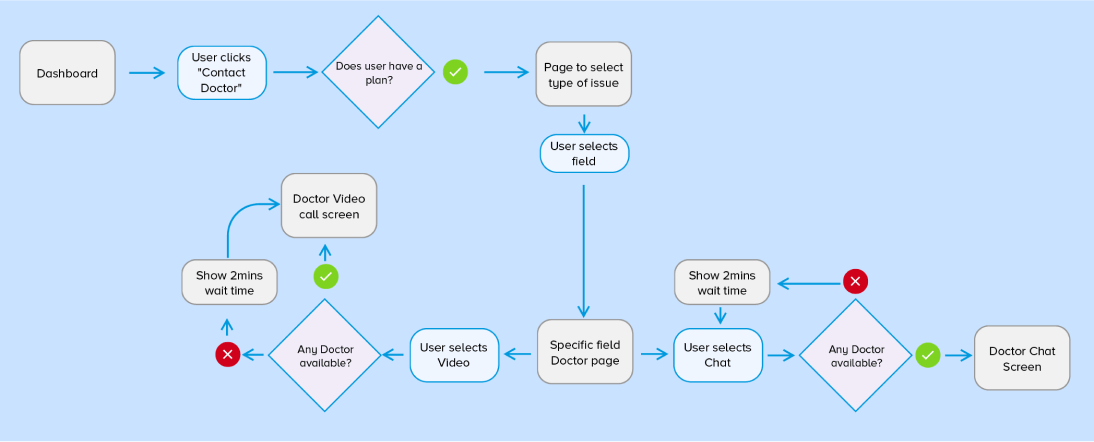
Core Task Flow
The core flow of the application was connecting a user with a doctor. I decided to go with a simplified task flow of the process for efficiency. For this project I had a constraint of exploring only one task flow and the MVP will be connecting the users to the doctor.
Iterations & Adjustments
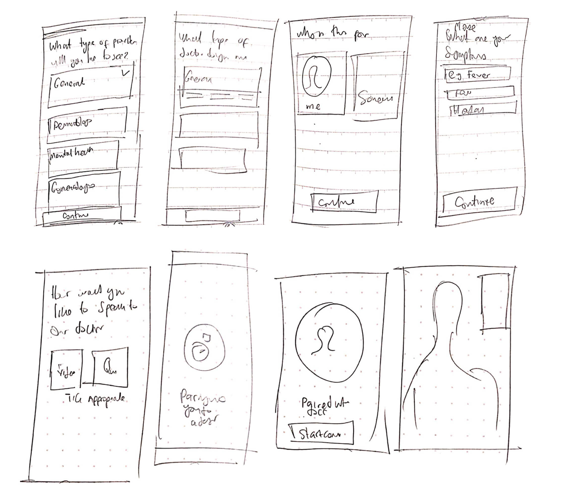
Once I got my core task flow all together I started to ideate on what the interface of my application could be from. From early Sketches to low-fidelity designs.
LAYOUT VALIDATION
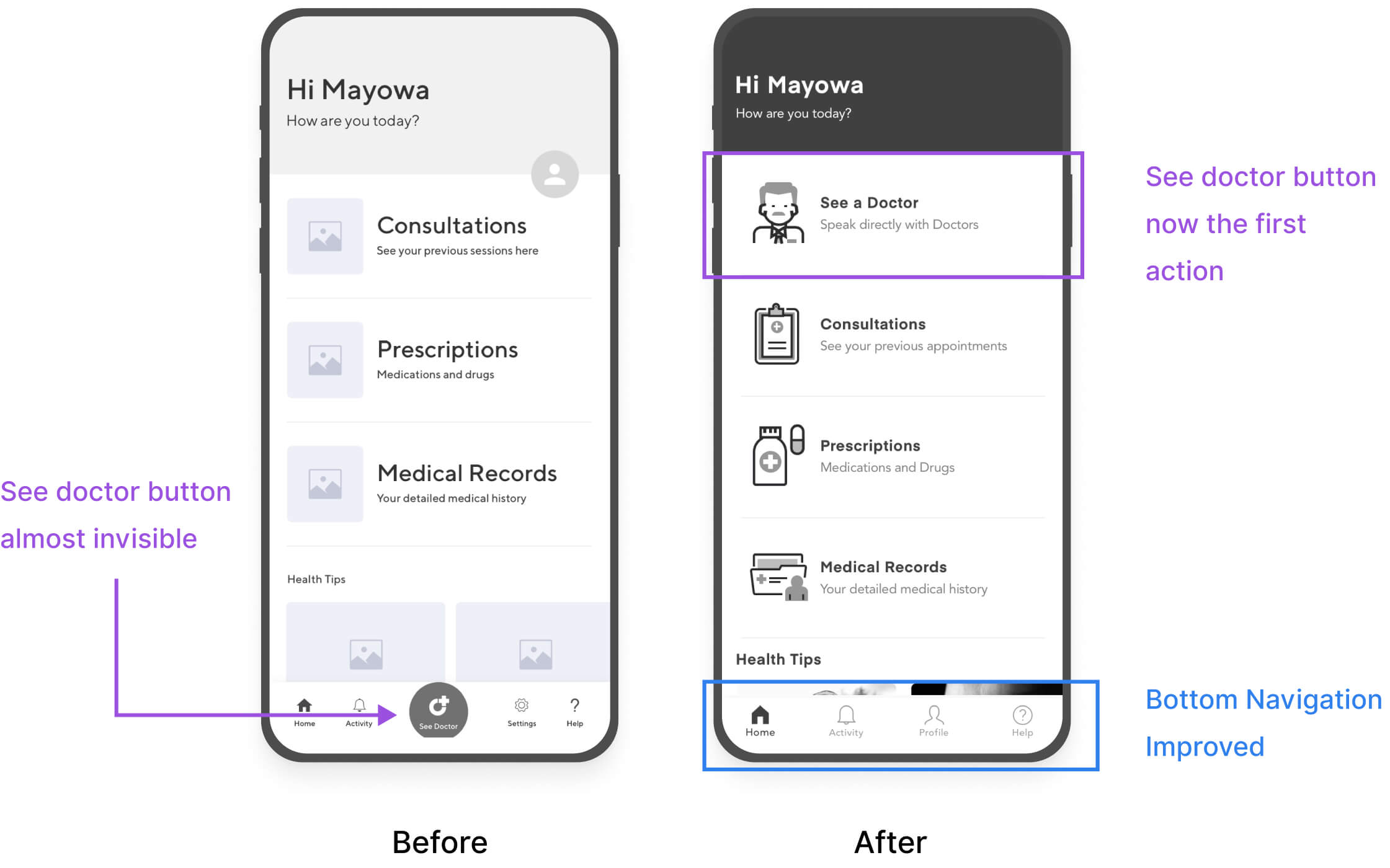
I created a first level of wireframes to validate the design layout with my users. My test users found it really hard to find the main action of the application. In the first layout the main action button “See a Doctor” was obscure and the bottom menu Tab needed to be revamped.
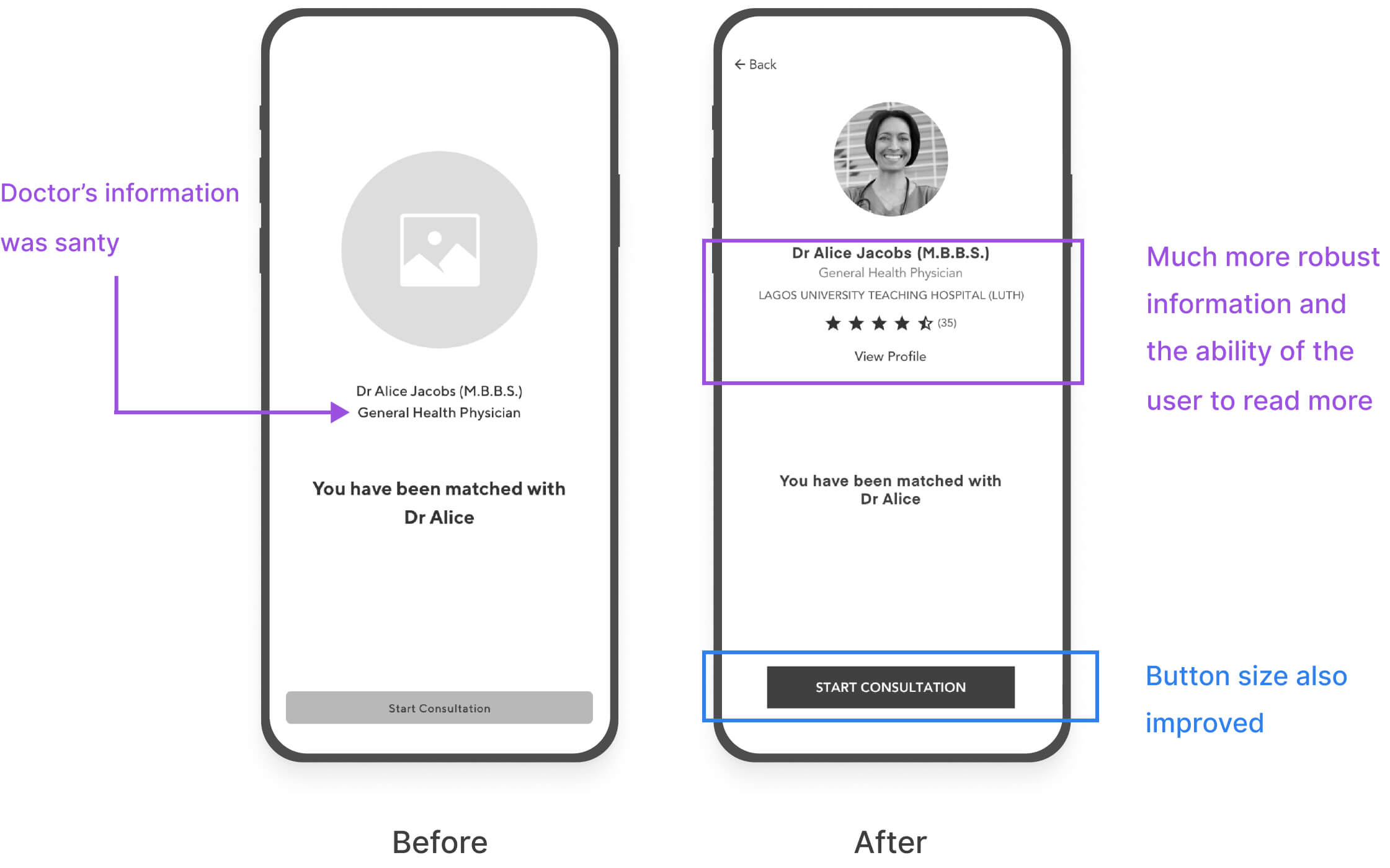
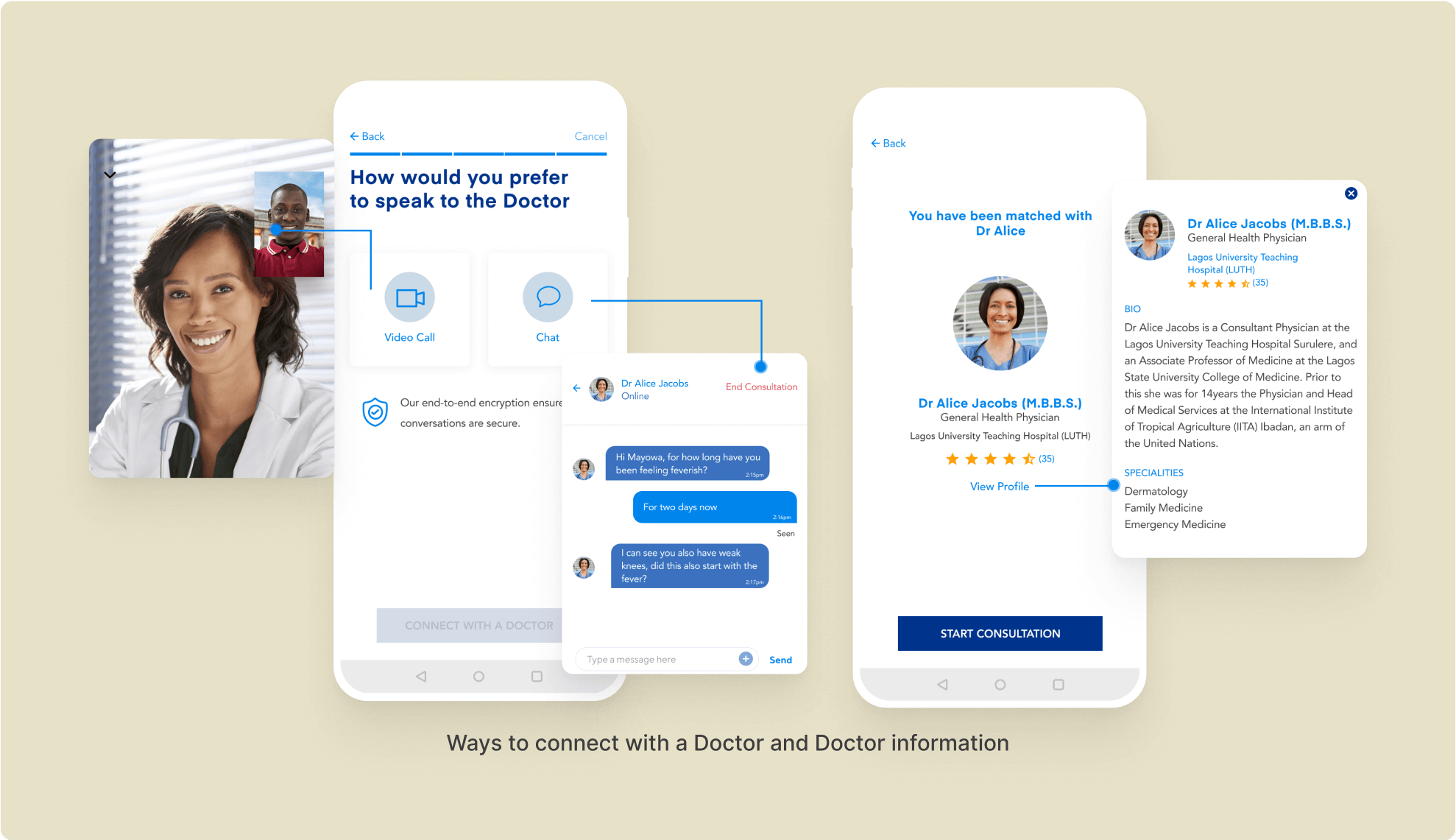
I also had a feature where a user would connect with a doctor, I got feedback that the users would want to see more information and qualifications of the doctor.
I DID NOT UNDERSTAND HOW DOCTORS ASKED PATIENTS QUESTIONS
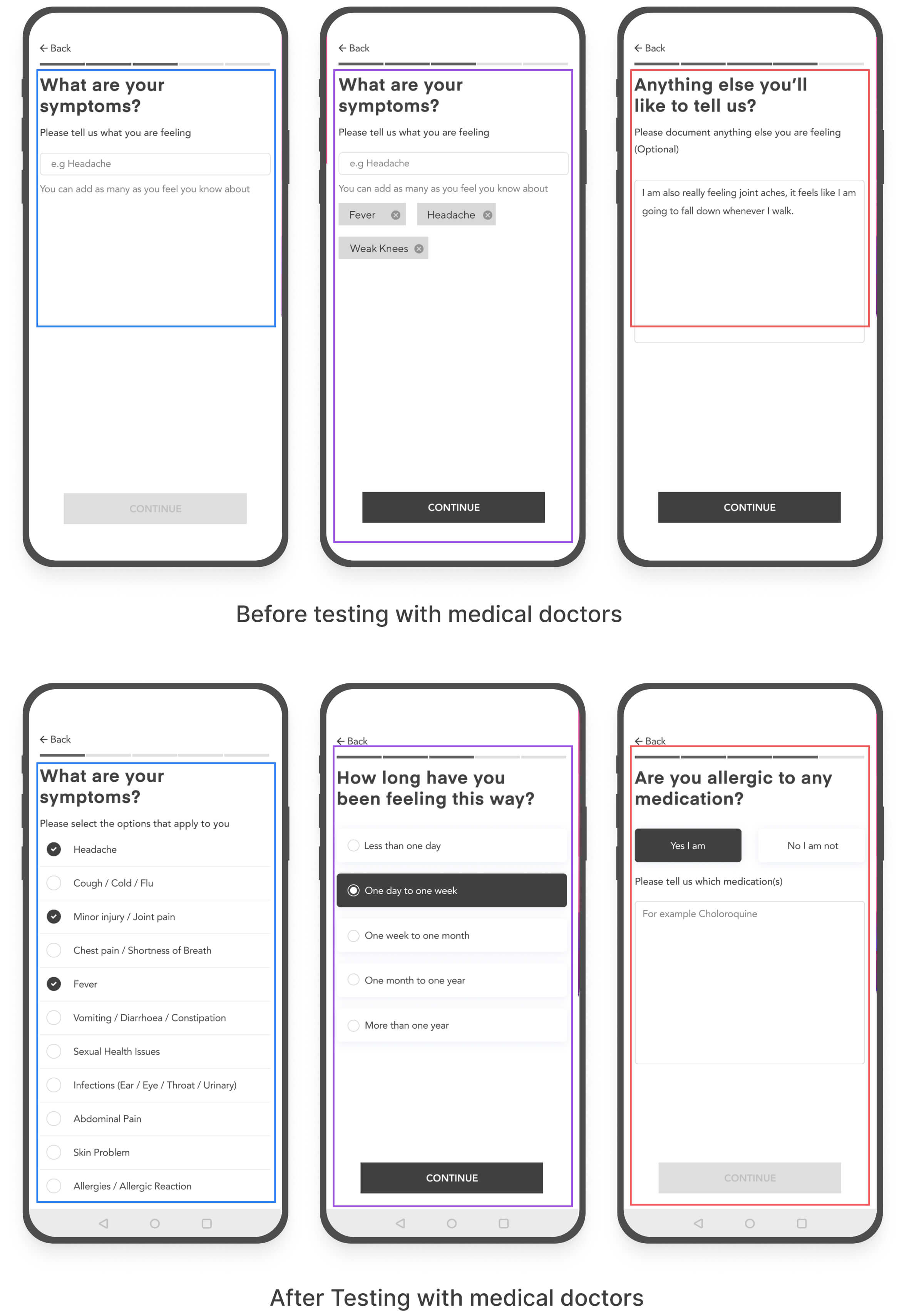
I tested my applications with 2 medical doctors and this revealed a huge flaw in my user flow. I learnt that medical doctors have a clerking process when trying to diagnose an illness.
The flow is:
1. Presenting complaint
2. History of presenting complaint
3. Past medical history
4. Drug History
5. Family history
6. Social History
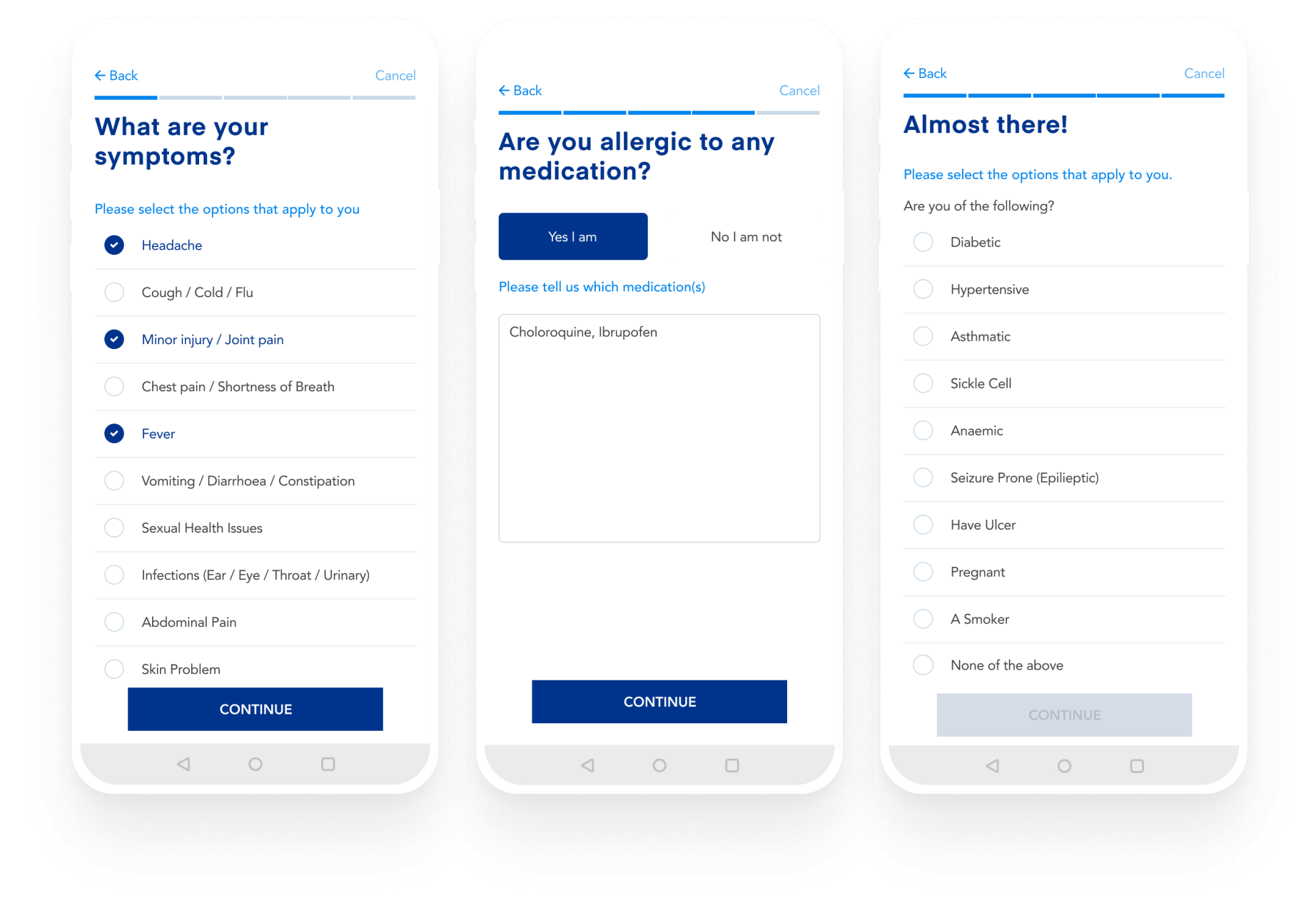
This revealed holes in my flow and I made changes to how I asked about symptoms from my users. I changed the whole flow and this resulted in better success.
I implemented a feature where users could search for their symptoms but from testing I was able to find that users could not find the right words to describe how they felt. I made adjustments after some
The final solution
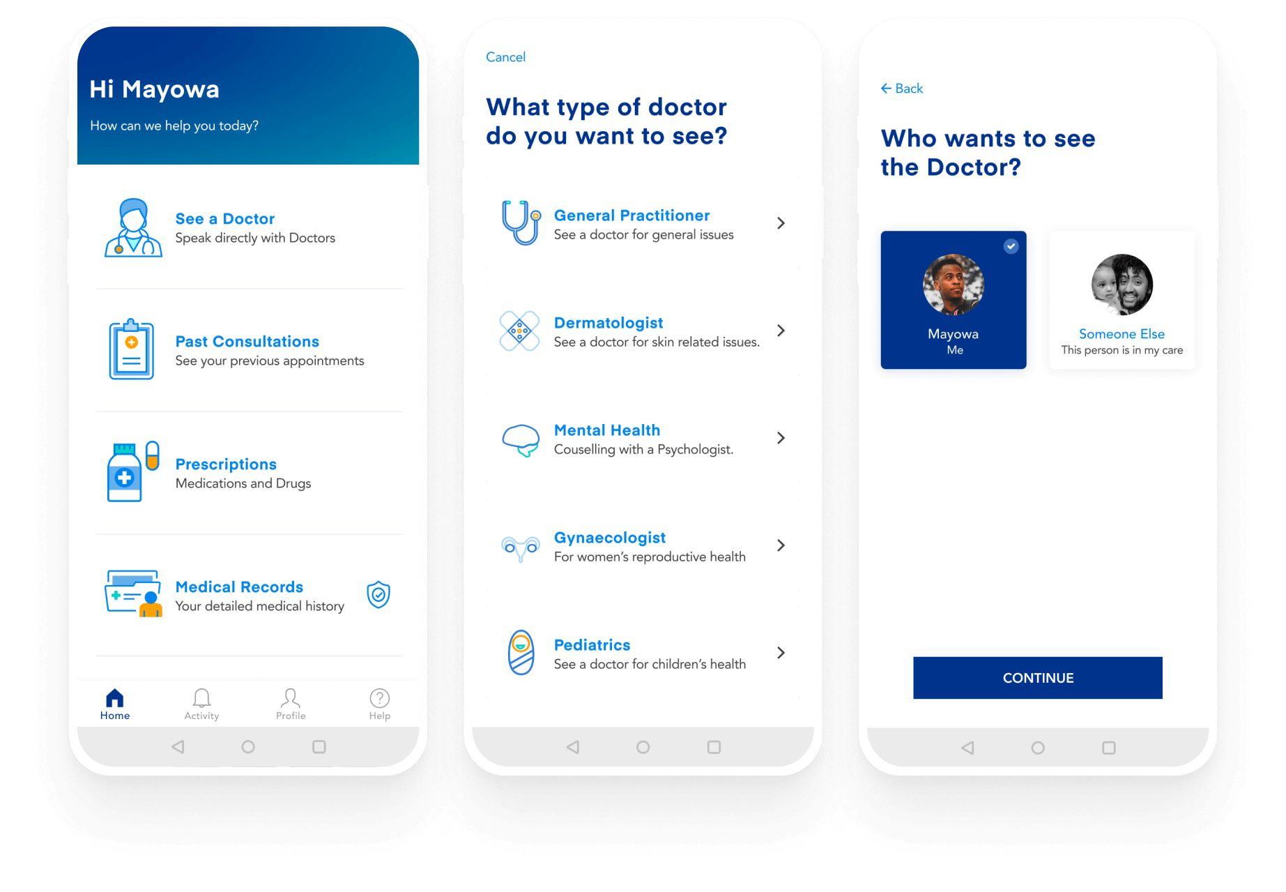
After usability testing sessions, I consolidated all the feedback and came up with high-fidelity designs for the product. I created the logo and colour scheme for the mobile application.
Medical services at your fingertips
The user has the ability to see a doctor, view information from past consultations and access prescriptions. They can also choose between a range of services and who the service is for.
Describe your symptoms through the app
The user can describe how they feel and this will help the doctor to have some information on what to dig deeper for on the call.
Chat with a doctor or nurse practitioner
Flexibility on how to speak with a doctor. Conversations can happen either through chat or through voice/video calls.
The possibilities of taking this to market
I explored what the marketing site for this application could look like. A marketing website with a strong value proposition will resonate with the target audience and will drive conversations. Incorporating features such as testimonials, press features and a vision of what pricing for this service will be, I believed will foster trust in our brand and conversions.
Aftermath & Retrospective
I found this project refreshing as it opened up my mind to different approaches to solving a design process.
01
The key learning for me was to get the input of specialists in the field of study early in the research process, especially if it’s in a regulated field.
02
I also learnt to Refine Interview questions to be more open-ended
NEXT STEPS
The next steps will be to conduct more user testing on the prototype I currently have to improve the user flow. I would also love to explore some more User Epics for the application, for example, sign up, on-boarding process, medical records and prescription possibilities.
NEXT PROJECT
Copyright @ 2021 Mosope Adebowale
